6,945 search results
(0.016 seconds)
- Monocle by Reserves,
$39.99 Monocle is a clean and contemporary monospaced geometric sans that excels in titling, data and numerical settings due to its clear and systematic design. The capitals-only format increases the harmony between letter pairings, opposing the irregularity of mixed case fixed-width typefaces. Stylistically, Monocle has the feel of a neutral sans, yet its underlying structural finish exudes a strong sense of order and authority. Its geometric foundation is especially pronounced in the constructed round forms. With multiple stylistic sets, individual letters can be exchanged to fine-tune text settings for a unique custom type solution. Features include: -Basic Ligature set including ‘f’ ligatures (ae, oe, fi, fl, ff, fh, fj, ft, tt, th, ct, st) -Alternate characters (O, I, S, G, R, Q, _, $, ©, #, •, %) -Slashed zero -Full set of numerators/denominators -Automatic fraction feature (supports any fraction combination) -Extended language support (Latin-1 and Latin Extended-A) *Requires an application with OpenType and/or Unicode support.
 - Lustra by Grype,
$16.00 Since the early 1980's, the automotive industry has been developing geometric/technical style logotypes for car chrome labels. The styles are ripe with inspiration for great font families, but surprisingly, many of these sleek logotypes are lacking an expansive family to enhance and express their brand in a richer sense, becoming true brand workhorses. The Lustra family finds its origin of inspiration in the HYUNDAI automotive company logo, and from there expands to an 8 font family of weights. Lustra celebrates the techno display styling of the inspiration logotype, transcending its brand inspired origin to give birth to a font family that pulls on modern and historical styles. It inherits a sturdy yet approachable style with its uniform stroke forms and curves, and goes on to include a lowercase, numerals, and a comprehensive range of weights, creating a straightforward, uncompromising collection of typefaces that lend a solid foundation and a broad range of expression for designers.
 - Dutch Mediaeval Pro ST by Canada Type,
$49.95 Dutch Mediaeval Pro ST is a special version of the popular Dutch Mediaeval Pro family, engineered specifically for science writing. It is equipped with SciType, a combination of additional characters and OpenType programming included in the fonts to help in typesetting science text. For more information about SciType, please consult the SciType FAQ available in the Gallery section of this page. The Dutch Mediaeval design is the historically renown one made in 1912 by S. H. de Roos. It stands out as one of the most classic Dutch text faces. This digital version comes in two weights and their italic counterparts. Aside from the SciType additions, all the fonts contain OpenType features for small caps and caps-to-small-caps, ligatures, ordinals, automatic fractions, seven kinds of figures, and a few ornaments. For details about the functionality of Dutch Mediaeval Pro ST, please consult its Access Chart PDF available in the Gallery section of this page.
 - Corporate A WGL by URW Type Foundry,
$210.99 The Corporate ASE typeface trilogy was designed by Prof. Kurt Weidemann, a well-known German designer and typographer, from 1985 until 1990. This superb trilogy consisting of the Corporate A (Antiqua), Corporte S (Sans Serif), and Corporate E (Egyptian) is a design program of classical quality, perfectly in tune with each other. Weidemann says: "My ASE trilogy, quite like triplets, is in perfect harmony and covers all needs of modern typography!" Initially exclusively designed for DaimlerChrysler as a corporate font, the ASE trilogy may be now licensed and used without restriction. URW++ digitized the ASE for DaimlerChrysler and Prof. Weidemann and is the exclusive licencing agent for this outstanding and extremely popular typeface program. Meanwhile, URW++ enhanced the Corporate ASE family in regular, bold, italic, and bold italic by Greek, Cyrillic, and all additional Latin characters to cover Eastern Europe including the Baltic Rim, Romania and Turkey. Corporate ASE in regular, bold, italic, and bold italic is now available in the WGL 4 character complement.
 - Eezyl by Partu Haodis,
$25.00 A title font that looks better as larger the font size. First of all, it is designed for use in the upper-case format. Feature style: futurism, space, modernism, glyph variety (uniqueness (minimum automatic generation)). A kind of „s‟ in the lower-case format sets the tone and emphasizes the character, formed in the Prime Numbers Nebula — they determined its appearance, and influenced the style as a whole. Particular attention is paid to the kern: the kern table is formed manually, taking into account absolutely all the glyphs included in the font-family. Two types of stress (grave, acute) for all letter glyphs. The font contains basic Latin and several additional tables, as well as three types of quotation marks, a non-breaking space and a hyphen, a short, medium, and long dash. For a set of mathematical expressions there are centrifugal signs: equal, minus (not a hyphen or minus-hyphen), plus, multiplication (X-shaped and dot), plus-minus, division. The font was made for 3 years.
 - Shopping Script by Roland Hüse Design,
$15.00 Shopping Script is designed after and inspired by my handwritten shopping list that was originally a lot less stylish, I have written each words multiple times to achieve the organic and natural flow with a bit spaced out style. This font is an existing work of mine that came in only one weight. Now I added multiple weights I as well as expanded and condensed instances, along with a weight and width variable font file that can be set to anything in between Thin Condensed to Heavy expanded. There are standard ligatures for it, jt, ll and tt, stylistic alternates for uppercase "A" and lowercase "e". For lowercase r and s there are contextual/initial variants when they are first letter of a word. A guide of open type features and how to activate them is available at https://drive.google.com/file/d/1q4j4X8ZntqgEUB8gUmflUNtmlX4IVQBq/view?usp=sharing Most latin based languages are covered from Western European to Eastern.
 - Burner by Graffiti Fonts,
$29.99 Burner is an advanced, connecting, wildstyle graffiti font family including over 200 unique letters, numbers & symbols. The family includes outlines, fills, details and more. Mix and match glyphs from 3 alphabets, add end pieces and more. Repeating flames, arrows & flourishes & other embellishments are included. The Burner family includes 3 full alphabets in each of the 4 styles as well as numbers, punctuation and a wide array of arrows, bars , begining & end pieces. Like some of our earlier wildstyle typefaces such as RaseOne or WildStyle, the Burner font family is a layered type system made to work as a team. In nearly any application 2 or more styles can be easily layered to create advanced, multicolor, wildstyle pieces. This layering system provides a shortcut to time consuming effects such as sharp corners & variable widths on outlines, fills & details. The original glyphs were all drawn by hand taking inspiration from actual painted & drawn wildstyles from RaseOne spanning the late 90's to about 2006.
 - Angie Sans Std by Typofonderie,
$59.00 A sanserif with human touch in 6 fonts Angie Sans is a low contrast incised sans serif sharing some similarities with Optima by Hermann Zapf and Pascal by José Mendoza, both created at the end of the 50’s. The later, feature an italic not published by the initial foundry who launched Pascal. Angie Sans follow same path with its italic based on Chancery forms from the Renaissance, narrower than the roman shapes. With its capitals based on Roman proportions, lowercases featuring open counters, strong horizontals, Angie Sans is a legible typeface. The manual gesture is present in Angie Sans, which offer the plastic qualities such as warmth, craftmanship and humanity. Angie Sans is an Incised Garalde who works well for display as text settings. Available in 6 series, with matching italics, Angie Sans will work well in design projects where delicate and human touch is required. Angie Sans Morisawa Awards 1990
 - Serat by Wahyu and Sani Co.,
$24.00 Serat is a medium contrast flared serif with mixed up styles of classic typefaces which is highly influenced by early stages of Latin based hand writing. The lowercase are modernized versions of Carolingian minuscules, vertical stems which touch the baseline have been modified to have horizontal cut for simpler look and keep the calligraphic style for terminals & stroke ends. Then the uppercase are flared serif which were influenced by Roman inscriptional capitals. The font name was taken from the Javanese word "serat" which means writing (noun). It comes with some unique features, such as: - Carolingian style alternate for some letters (a,e,f,g,t), also comes with separated stylistic set for long 's', and long left leg 'x' and alternative ampersand. - Discretionary ligatures for all caps titling. - Standard Ligatures. - Tabular and Proportional for both Lining and Old-style figure. - Fraction with Nominator and Denominator. - Superscript and Subscript for numbers, etc. Serat would be suitable for "classic" themed work; poster, book cover, branding, videography, etc.
 - Roos ST by Canada Type,
$39.95 Roos ST is a special version of the Roos family, engineered specifically for science writing. It is equipped with SciType, a combination of additional characters and OpenType programming included in the fonts to help with typesetting science text. For more information about SciType, please consult the SciType FAQ available in the Gallery section of this page. The Roos design is the Dutch classic made by S. H. de Roos during the years of the second World War, and subsequently used for a special edition of the Dutch Constitution on which Juliana took the oath during her inauguration as the Queen of the Netherlands. This design is widely regarded as de Roos's finest, and has one of the most beautiful italics ever drawn. Aside from the SciType additions, all the Roos ST fonts contain OpenType features for ligatures, ordinals, automatic fractions, and seven kinds of figures. For details about the functionality of Roos ST, please consult its Access Chart PDF available in the Gallery section of this page.
 - Direct Mail by Partnrz,
$15.00 Direct mail designers rejoice! Finally, a font family made just for you. Created to be as in-your-face as possible: for use as a primary headline; for dates and phone numbers; and for coupon heads and price points. Tired of kerning numbers for your coupons and prices? Then you'll love this font! All of the kerning has been done for you. (No more spacey 1's!) Designed for a tight kern - just track it in on larger sizes. Instead of standard weights, this font was designed to fit different width needs. Have a long headline, but your client wants it in one line and tall? Use the extra-condensed. Need something really bold for a phone number or price point, but you don't have much height available? Use the fat. And there are two more widths for those in-betweens. And to top it off - you can get them all in an oblique as well.
 - Babetta by Viktor Nübel Type Design,
$- Babetta is a display typeface that comes with some decorative typographical features. Alongside a set of arrows and flower icons, it also includes an alternative ›E‹, some special diacritic marks, a wavy ›S‹ and a series of ligatures. It features 5 weights, a special ›Neon‹ version and supports a wide range of Latin languages. This typographical tool box provides a large and playful variety of options for headlines and logotypes. Babetta supports Latin and Cyrillic languages. The initial inspiration for Babetta was an illuminated vintage shop sign—that of a famous bookstore in Berlin called Karl-Marx-Buchhandlung that dates back to the days of East Germany. During the course of the design process, this slightly shabby historical original was kissed by an Italian Art Deco beauty and has blossomed into a new typeface with its own special charm. The aim was not to preserve the original lettering, but to use it as a starting point for typographical exploration.
 - Hyper Turfu by Bisou,
$10.00 Made in La Chaux-de-Fonds (Switzerland), HyperTurfu was born during the shooting of “The Return of Hyperturfu Xpress 2”. A GoPro on a lego electric train, meters and meters of rails, an empty industrial space, loads of puppets, paper, cardboard, pizza boxes, lights, hot glue and a bunch of friends preparing a one shot scene for a month. The title of the movie was made out of lego pieces, painted with golden spray and hanged over the rails. It was the first inspiration for this awsome superbold font. HyperTurfu is thought from ground up to give a strong impact. It’s gothic retro science fiction 80’s style makes it best suitable for metal music albums or posters. As the “Banco” font it works perfectly with short texts for advertisement, bar, cofee shops concert places or even fancy hairdresser. Just hang it over a pet shop and see what cool animals will come in.
 - 1543 Humane Petreius by GLC,
$42.00 The regular style of this family was inspired from the typeface used in Nuremberg, Germany, by Johannes Petreius in 1543 to print the famous “De Revolutionibus Orbium Coelestium,” the well-known mathematical and astronomical essay by Nicolaus Copernicus. Petreius was also using an original italic style, as he did for the “De Sculptura” by Gaurico Pomponio, in 1542. Unfortunately, nobody seems to know who was the punchcutter of this Jenson-style font. Also included is a title file, containing initials (without diacritics) and small caps (with diacritics). In our three styles (Regular & Italic + Titling), font faces, kerning and spacing are as closely as possible identical to the original. This Pro font is covering Western, Eastern and Central European, Baltic and Turkish languages, with standard and long-s ligatures in regular and italic styles. Both have twin-letter ligatures, but the italic style has extra (genuine) ligatures for f and t with vowels.
 - FingerSpeller BF by Bomparte's Fonts,
$40.00 Many years ago I studied American Sign Language in an effort to better communicate with some friends of mine within the deaf community. I found ASL to be a beautifully expressive language from a vibrant and active culture. Out of that attempt came this stylized depiction of the manual alphabet used in finger-spelling. Until recently it had only existed in analog form, born of pen and ink on paper. So now I'm glad to say it’s turned digital. Typing a period (.) will reveal the sign for “I Love You” (a combination of the letters I, L and Y), which fits nicely within the shape of a heart. Holding down the shift key while again typing period (greater symbol) will reveal the heart in its filled-in form, which can serve as an underlay. Use these in an application that supports layering in order to create different color combinations. There’s a stylistic alternate letter “S” and an “OO” ligature which can be accessed in OpenType-savvy apps.
 - Data Error AOE Pro by Astigmatic,
$24.00 The Data Error AOE Family was one of my earliest typefaces, at a time when I had become obsessed with all forms of "digital/techology" typestyles. It's been awhile since the early 2000's, but I've had a hankering for awhile now to revisit this typeface, giving it a more expansive language character set and fill it out with some Opentype features. Inspired by some old printouts of BASIC programs and an Atari 1050 Disk Drive manual with pin printer examples, comes the familiar yet oddly restricted style with this Data Error family. This family comes complete with Regular and Bold versions with their respective Oblique versions. Odd pin printer restrictions inherent in this typeface are: no characters extend below baseline or above ascender line, (except international accents). A nostalgic typeface for computer programmers everywhere, strong and legible at any size, Data Error is perfect for so many purposes, get it today!
 - Pekin by HiH,
$15.00 Pekin is an unusual design with an oriental flavor. It was originally designed by Ernst Lauschke and released by The Great Western Type Foundry of Chicago as “Dormer,” which is similar to the French verb ‘to sleep,’ not exactly a marketing triumph. Barnhart Bros. And Spindler (independently-operated subsidiary of ATF since 1911) bought Great Western in 1918. According to McGrew, AMERICAN METAL TYPEFACES of the TWENTIETH CENTURY, BB&S renamed the typeface prior printing their 1925 specimen book — guess they wanted something just a tad more exciting. Quirky, distinctive and fun. Pekin ML represents a major extension of the original release, with the following changes: 1. Added glyphs for the 1250 Central Europe, the 1252 Turkish and the 1257 Baltic Code Pages. Added glyphs to complete standard 1252 Western Europe Code Page. Special glyphs relocated and assigned Unicode codepoints, some in Private Use area. Total of 415 glyphs (compared to 218 glyphs in the original release). 2. 652 Kerning Pairs. Note: Ag, Aj and gj will cross unless kerned. Alternative A may also be used. 3. Added OpenType GSUB layout features: onum, salt, liga, dlig, hist, ornm and kern. 4. Revised vertical metrics for improved cross-platform line spacing. 5. Refined various glyph outlines, based on improved scans. 6. Added set of Tabular Numbers at cap height, based on original design; added Old-Style Numbers based on default design. 7. Added a bunch of alternative characters: 18 upper case letters, 10 lower case letters, 1 ampersand and 1 bullet. The alternate c is actually the original design, but I don't like it - easily confused with e. Alt E H M h m n r t are from the original design. I added the rest. 8. 7 Ligatures, 4 Ornaments, 18 Geometric Shapes, 6 Arrows and 12 Misc. Symbols. The zip package includes two versions of the font at no extra charge. There is an OTF version which is in Open PS (Post Script Type 1) format and a TTF version which is in Open TT (True Type)format. Use whichever works best for your applications.
 - CP Company by FSD,
$23.37 C.P. Company is a group of types including 4 different forms and it is a complementary sign of communication for the C.P. Company clothes maker. C.P. Company communication makes use of media such as the press and the web and that’s the reason why we have always felt the need for a font that would not show incongruities through the monitor. Therefore we have decided to change the structure of glyphs like a, e, g, s… in the most contrasted versions to prevent the serifs from touching the internal parts of the letters and in this manner we have made a really unusual stylistic choice for a group of types. The difference between the height of caps and smalls is very low (about 20%) so that the smalls are easy to read even when their dimensions are on a very small scale. Moreover this stylistic solution gives the possibility to avoid using the small capitals in case of charts and catalogue codes (i.e. Tricot M5) and provides more vertical compactness between the lines. Even a sentence written in capital letters next to another one written in smalls does not look so much contrasted from a typographical point of view and then it is not unpleasant. The limits due to different constructive principles have been overcome by means of a grid based on the automatic division of EM square of 9-point type and in this manner the letters have a wider face. The font is even more unusual owing to the style chosen that belongs to the classical tradition of hair-lined types for glyphs like e and also thanks to ligatures like ? in the characters set. CP Company is a geometrical font whose alphabet makes use of the style of types that preceded the Helvetica, matched with more experimental and updated solutions. Numbering is monospaced. The bending of number 2, the slight raising of the oblique serif of number 4 and the presence of a hair-line in number 7 are the solutions adopted to make the types match in a more balanced manner.
 - Scorno by Rosario Nocera,
$22.99 Scorno is a geometric sans serif that offers a high legibility also in the lighter weights. Scorno is ideal for sports and technology. The shape of its letters makes it different from most geometric fonts, making it suitable for branding, magazines, catalogues and much more. Scorno is available in nine weights, from thin to heavy plus matching italics and it comes with open type features like old style and lining figures, ligatures, numerator, denominator, scientific figures, and fractions. What’s more, it also features the bitcoin symbol in the currencies set.
 - Adoloen by Gian Studio,
$16.00 Adolone We are proud to present our new font. The new natural Adolone look with a classy and modern style makes this font look elegant, natural, stylish. Adolone will be perfect for invitations, logos & branding, photography, advertising, watermarks, social media posts, product packaging, product designs, labels, wedding designs, stationery, special events or anything else needed to create a theme. Adolone is built with OpenType features and includes initial and final language styles, alternative characters for most lowercase letters, numbers, punctuation marks, alternatives, ligatures, and also supports other languages.
 - Epic Kantona by Hikhcreative,
$18.00 Epic Kantona Signature is an elegant and a smooth casual monoline signature stylish script. It is perfect for branding projects, logos, wedding designs, social media posts, advertisements, product packaging, product designs, labels, photography, watermarks, invitations, stationery and any projects that need handwriting taste. Epic Kantona works both on Mac & PC. Simple installations, Alternates & Ligature and Multi-lingual Support. Accessible in the Adobe Illustrator, Adobe Photoshop, Adobe InDesign, CorelDraw. This type requires the support of OTF font such as AI, Photoshop, Affinity, Corel and so on. Follow our behance for updates : https://www.behance.net/hikhstudio
 - Barkanon by wearecolt,
$29.00 Barkanon is not your ordinary humanist sans serif typeface. Blending modern styling with classic humanist flow creates a bold and captivating look. Designed to be expressive in the right places and legible where needed. Barkanon is great for headings, body copy, logos, etc. Barkanon was picked to be a part of the 2024 Typodarium and an early version of the font was featured on James Edmonson's (Oh No Type Co) YouTube channel Barkanon covers 96 languages, 9 styles plus italics, with stylistic alternates, ligatures, and other opentype features.
 - Just You by MC Creative,
$10.00 Just You is an elegant calligraphy and natural script style. Just You Modern Calligraphy is perfect for wedding designs, shared moments, branding projects, logos, social media posts, advertisements, product packaging, product design, labels, photography, watermarks, invitations, stationery, and any project that requires a handwritten feel. What’s Included : · Standard glyphs · Ligature · Works on PC & Mac · Simple installations · Accessible in the Adobe Illustrator, Adobe Photoshop, Adobe InDesign, even work on Microsoft Word. · PUA Encoded Characters – Fully accessible without additional design software. · Fonts include multilingual support for; ä ö ü Ä Ö Ü ß ¿ ¡
 - Antique Spenserian by Dharma Type,
$24.99 This antique script is based on Spencerian script released from MacKellar, Smiths, & Jordan in the 19th century. This family comes in two varieties, Standard and ornamented capitals. The Standard has orthodox style for formal text and display. This makes it possible you to use this style for any projects. The unique Ornamented is suitable for eye-catching part of your project: headlines, wedding invitations and logo. Every glyphs were added antique and distressed effect by hand work with great care to be looked like natural. Use your ideas to enjoy this exclusive script.
 - Leegione by Almarkha Type,
$35.00 Introducing The Neon Sci-fi Futuristic Font called Leegione A unique font with a futuristic style can make your futuristic logotype more interesting. Inspired by real world neon light signs, this font is perfect for adding your own glowing light effects or can be used to actually design real world neon signs. Leegione fonts with 9 unique ligatures are ideal for your project and will allow you to create beautiful designs, headlines, posters, logos, badges, and much more. It is also best used for posts, logos, posters, labels, and more.
 - Shifters by Arendxstudio,
$17.00 Shifters Handwritten Script is a font with distinctive handwritten characters and is perfect for branding projects, logos, wedding designs, media posts, advertisements, product packaging, product designs, labels, photography, watermarks, invitations, stationery, and any project that needs a handwritten touch. Features Character Set A-Z , Numerals & Punctuations (OpenType Standard), Accents (Multi-lingual characters), Ligatures. There it is! I really hope you enjoy it. Comments and likes are always welcome and accepted. More importantly, don't hesitate to send a message if you have a problem or question. Now just read this, go there and make it happen.
 - Shabby Patty by Scratch Design,
$12.00 Shabby Patty is a playful, cheerful and cute font that is ready to accompany your design projects. This font also has retro and vintage characteristics that are perfect for 90s design. This font will be perfect for quotes, cover designs, merchandise, posters, creative posts, birthday cards, packaging, logos, labels and more. What you'll get: Uppercase and lowercase Numbers and punctuation Multilingual support Ligatures We highly recommend using a program that supports OpenType features and Glyphs panels like many Adobe apps, so you can see and access all Glyph variations. We hope you enjoy our font!
 - Chillink by Four Lines Std,
$15.00 Get ready to chill and thrill with Chillink Font! With its bold and playful style, this font is sure to make your text pop and stand out from the crowd. Plus, its unparalleled readability and versatility make it the perfect choice for any project, whether it's a social media post, website design, or even a logo. The best thing about Chillink Font is that it's so easy to use! Just copy and paste it into any project, and you'll be ready to go in no time at all.
 - Carelia by My Creative Land,
$29.00 Carelia is a modern multilingual (including cyrillic) serif family with classic forms, enhanced by extended OpenType features. It is well suited for all sorts of design - starting from web, to editorial and branding. Its stylistic alternates, swashes and ligatures (more 1200 glyphs in each font) will make your design even more stylized and unique. Carelia comes in two styles Upright and Italic - each has it's own character but both share the same curves and style. Both fonts are fully unicode mapped - can be used in any application of your choice.
 - Sunday Chillin by Hoperative Design,
$15.00 Sunday Chillin is a gorgeous and retro-styled script font crafted to add tons of stylish character to your designs. This font is PUA encoded, which means you can access all of the glyphs and swashes with ease! This font can be used for logos, branding, invitations, stationery, wedding designs, social media posts, and much more! Sunday Chillin Features : Ligature Kerning Uppercase and Lowercase Number and Punctuation Stylistic Alternates Stylistic set 01 Stylistic set 02 Stylistic set 03 Swash PUA encoded which means you can access all glyphs Multilingual Support Thanks, Hoperative Design
 - Diamond Ring by Dharma Type,
$24.99 Diamond Ring is an Art Deco font inspired by Japanese designs for cosmetic packaging and posters used from the end of the 19th century to the early 20th. The most distinguishing characteristic is the diagonal parts of the glyphs. All diagonals have the same degree of the angle. By this elements, whole design of this font and typography with this font look like the shining of diamond ring during total solar eclipse. When you prefer more humanly letter form, please try our Yasashii that used in La La Land.
 - Architype Albers by The Foundry,
$50.00 Architype Konstrukt is a collection of avant-garde typefaces deriving mainly from the work of artists/designers of the inter-war years, whose ideals have helped to shape the design philosophies of the modernist movement in Europe. Due to their experimental nature character sets may be limited. Architype Albers draws on early grid-based attempts by Josef Albers, in 1926, to design an alphabet by reducing the forms to purely geometric elements – the square, triangle and parts of a circle – and in the process creating an unusual stencil effect typeface.
 - Ankashi by MC Creative,
$12.00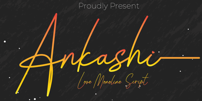 Ankashi is monoline script font which natural movement and elegant for signature style. Ankashi is perfect for branding projects, logo, wedding designs, social media posts, advertisements, product packaging, product designs, label, photography, watermark, invitation, stationery and any projects that need handwriting taste. What’s Included : Standard glyphs Ligature Works on PC & Mac Simple installations Accessible in the Adobe Illustrator, Adobe Photoshop, Adobe InDesign, even work on Microsoft Word. PUA Encoded Characters – Fully accessible without additional design software. Fonts include multilingual support for; ä ö ü Ä Ö Ü ß ¿ ¡
 - Gotten Say by Rhd Studio,
$20.00 Gotlen Say, I hope you are interested in this font, if you want to use it for your work This font can be used easily and simply because there are many features in it it contains a complete set of lowercase and uppercase letters, various types punctuation, numbers, and multilingual support. Fonts also contain several Binder and Device Style Style for those of you who have software it can work. Any question? Send me a message! I'm ready to answer any pre-sale or post-purchase questions you may have about this product!
 - State Wide by Arkitype,
$10.00 Say hello to State, this family is inspired by sport and a further development on Comply Slab. This family of fonts has some bold letters as well as stylistic alternates to give your layouts some interesting variation. State comes in 3 styles, Regular, Soft and Rough each with 7 weights and italics. It was specifically designed with a wider structure for better appearance in small sizes and the extra attention to the detail was needed for the big sizes. Use State to get the delivery you need, whether its for print, online or Television.
 - China Market by Pelavin Fonts,
$20.00 The initial characters in China Market were created in 1996 for a logo featuring the Temple of Heaven in Beijing where emperors from the Ming and Qing dynasties worshiped heaven and prayed for abundant harvests. The font was completed in 2010. It is composed of a regularly positioned curved and straight components as if part of a decorative grillwork or other architectural detail. While its influences and origins are clear, its appearance is relies more upon the geometry of its basic elements and the modular structure than a specific stylistic idiom.
 - Grace & Hope by HandletterYean,
$16.00 Grace & Hope is a beautiful handwritten font. It features doodles and underlines. This eye-catching font will take your designs to the next level! Fall in love with its authentic feel and use it to create gorgeous wedding invitations, beautiful stationary art, eye-catching social media posts, and cute greeting cards. To access the alternate glyphs, you need a program that supports OpenType features such as Adobe Illustrator CS, Adobe Photoshop CC, Adobe Indesign, and CorelDraw. More information about how to access alternate glyphs, check out this link: http://goo.gl/ZT7PqK
 - Fun Time Nouveau JNL by Jeff Levine,
$29.00 “One Hundred Alphabets for the Show Card Writer” was published in 1919 to afford sign artists the ability to create signs and show cards in then-contemporary lettering styles. One such alphabet was big, bold and representative of the Art Nouveau stylings popular in the early part of the 20th Century. Most likely it was applied to store sales and public events that were casual and informal, for its letter forms are free of any constraints. This design is now available as Fun Time Nouveau JNL in both regular and oblique versions.
 - FF Oxide Solid by FontFont,
$62.99 American type designer Christian Schwartz created this display and sans FontFont in 2005. The family contains 3 weights: Light, Regular, and Bold and is ideally suited for advertising and packaging, music and nightlife, poster and billboards, software and gaming as well as sports. FF Oxide Solid provides advanced typographical support with features such as ligatures, titling alternates, case-sensitive forms, fractions, and super- and subscript characters. It comes with tabular lining and proportional lining figures. This FontFont is a member of the FF Oxide super family, which also includes FF Oxide Stencil.
 - Notte Alexia by Joelmaker,
$20.00 Notte Alexia Serif & Script an old-fashioned font that has been rewritten in a modern style combined with unique ligatures and beautiful and attractive swirly, making this font even more energetic and paired with a very beautiful Script so that it looks more dynamic. Note Alexia Serif & Script,can be used for various purposes such as Magazine Title, Poster, Logo, T-Shirt, Sub Title, Business cards, Magazines, Book Covers, Wedding Invitations,Templates Instagram Story Post, Greeting Cards, Quotes, etc. Features: Stylistic Alternates Swashes Titling Alternates Stylistic Set Standard Ligatures Thank You Very Much.